Explore our colours
Our palette holds many shades, but it’s within the colour families that they find their logic and structure. Read more about each colour family below.
Order a colour sample to experience the shades in your hand – or get personal guidance through our design help.
Colour is the most immediate expression of architecture
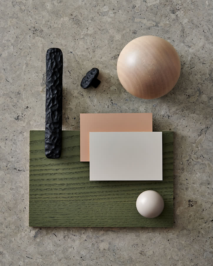
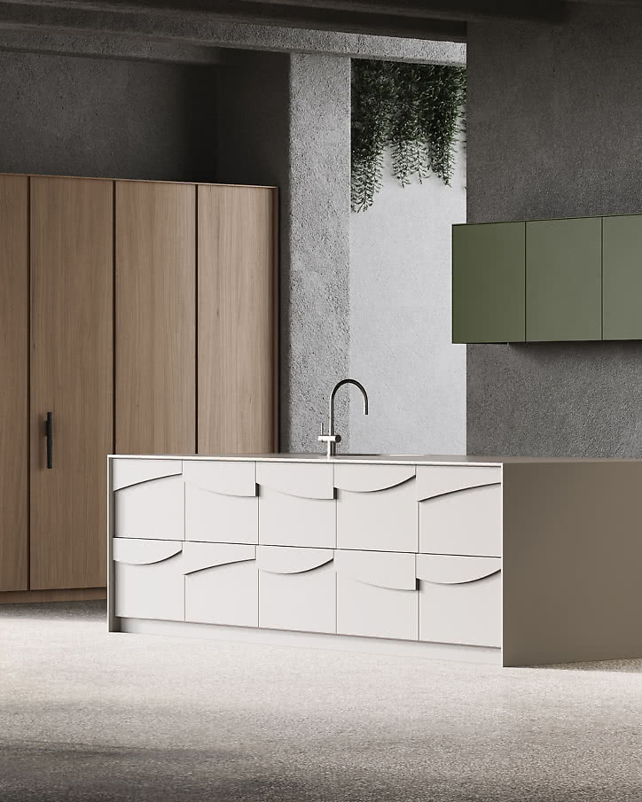
In dialogue with other materials, the perception changes. Against stone, a shade becomes softer; against wood, more vibrant; and against metal, it gains a new sharpness. Just as wood types and surfaces influence each other, colours also shift with the light and the proportions of the room. In this way, colour becomes a material that creates balance, contrast, and depth in the interior.
Alvar Aalto described colour as part of the human dimension of architecture – what makes a room a place to live in, not just to observe.
How do you know which shade to choose?
It can feel difficult to know which shade will stand the test of time and work in your home. Our palette holds many shades, but it’s within the colour families that they find their logic and structure. They are designed to show how colours relate to each other and to make it easier to find your way among everything from timeless neutral bases to bold statements.
By gathering our colours into families, we want to give you both a tool and inspiration – guidance to understand why some shades enhance each other, why others merge into a whole, and how colour can be used as a material to create balance, contrast, and depth. But our colour families are not rules; they are a map that makes it easier to navigate the world of colour – whether you seek harmony or want to create something entirely your own.